Friday, 10 February 2012

Feedback on Directors commentary

Excellent and considerate understanding of the technologies used in production of the video for example After effects and FCP..  There are evident links between creative decision making and use of technology on both productions of the video using professional digital cameras (e.g focus pulls) and in the post production editing process – in discussion of continuity.  This is sustained and thorough and accurate in discussion of the art deco themes of the MV.  The commentary shows a discrete awareness of the use of new media technology and uses discriminating examples really well in terms of graphic design and animation.  Excellent command of terminology and well presented.

Covers sound and technology. Exemplifies After Effects well and the use of chromokey as an effect.  Excellent commentary, well done.

Feedback on Director's Commentary

Evaluation Task 4


The first stage of the development in Photoshop was the coloring.
In this shot we colored in different ways to see what worked best. The faded blue shades, in mine and my group’s opinion worked well with the black and white however we ended up not using these images in the final digipak as it didn’t fit with the final design although it really helped me learn more basic skills on Photoshop to practice and use the trial and error technique till we felt as a team it looked right.


The main image on our digipak was the close up of our actress Georgina. We manipulated this image in many different ways until we found an image we liked to start with we put the image next to each other to see the comparisons and whether just the one image repeated made a good design putting all the necessary items on the digipak we decided it didn’t look close enough to our chosen design. We then went back and kept the one image we had worked on from the start because we wanted to keep the star image as the main aim of the image of the band.
We used art deco from Internet images and Internet colors I selected using print screen and the clone tool. Selecting images of my own from the dancers I filled in the figure and deleted the background to create a silhouette like our art deco in after effects in the music video.


I used the layering tool to layer the same image on top of each other and surface blurred on in the liquefy tool. Then I used the rubber to rub the few flaws to blur them our and create a fake perfect complexion. I then selected the burn tool and used it around the eyes and the pupil to create an idea of bigger thicker eyelashes. I then used the dodge tool to lighten up the whites in her eyes and then changed the tints through turning it black and white and experimenting with the contrasting levels
The poster consisted of many different ideas we started with the idea of having a blocked square look like this is here and we decided it was not good plan for the final poster idea so we started fresh with a now concept of building it around one of the squares on the digipak with the color theme and the silhouette. I did this on Photoshop by selecting the main theme using the magnetic tool and then filled it in with the block color, and experimenting with the layering texts that you can add onto a new layer in Photoshop. 


Saturday, 14 January 2012

Feedback

Please post presentation for evaluation task 1.  This is a ell presented PPT.  You do need to address the set question, which is absent from the presentation.  You are being asked to evaluate the use, development or challenges to media conventions.  You also need to include a wider range of exemplified links to real media products.
We spent a lot of time reading of the conventions used in music video which I feel that you have not really cited in your blog entry.  Can you please ensure that you do so when redrafting evaluation task 1.

Wednesday, 11 January 2012

The cast


Our lead Georgina Morton
Her performance was very efficient and was very nice to work with

One of our dancers Tunde Ogundare was very nice to work with and respnded to our advice and directions

Connor Vickery was the white upper class character and the dancer with the walking stick

Saturday, 24 December 2011

Story Board

The lead singer with a spot light wearing jewels and dressed nice in the 1920's fashion to show off the star persona as a glamourous woman talking about money in the 1920's

Working class dancers to show a contrast of how people can enjoy the music whether they have money or not and this is showing the main theme of our video and message

We are planning to shoot one image and have the same this we will do in post to create a modern feel to the old fashioned video to go with the song

Monday, 19 December 2011

Digi pack exploring into the art deco and art nouveau

The 20's were known for their art deco styles and pre 20's the Art nouveau this was a hugley stylish aspect of the 20's and it influenced us very much into the design of our entire video and digi pack.

Friday, 2 December 2011

Thursday, 24 November 2011

DIDGY PACK

This went through a serise of stages

The final decision however was to use the same image over and over again instead of different ones, this was becuase the others didnt compare to this and we could then put an extra twist on the album by using the idea of album covers being influenced by art. In this case Andy Warhole

first trial

Saturday, 19 November 2011

Feedback

There are some sound entries here, but I would like to see the digipak blogged.  The use of photo's from the day are excellent, but could have been presented in a much better way as a slideshow or other presentation.
Your written account of the shoot day is brief - you need to reevaluate this and link your comments to that of production - consider film direction, set design, how the MV was shot etc - be as precise as possible with this and please post your CD design.

Friday, 18 November 2011

CD COVER AND POSTER


For our CD pack we had a few ideas that we tried out using photoshop.

The first idea was of was to pick a selection of images from our photoshoot on the shoot day and edit them into some cool effects. The first would be of the main singer only (Georgina). We thought that to use some close ups of her face to emphasis the style of the 20’s with the make up and the feather in her hair, and It would be edited using photoshop to manipulate the colour and make it look more like an old photograph, gone new like the song instead of the generic CD cover.
The name of our artist would appear vertically down the side of the front cover in a fancy red font. This we dcided to call ‘Dotty and the Deckz’ this was a spin off an old name with the new idea of how the song has been remixed using decks, this we wanted to make more stylaised so we changed the s to a z which we thought was a cool and catchy title.

here we have experimented with different medias, i have started with air brushing and enhancing areas such as eyes, hair etc. I then decided to try different areas of the image in black and white squares, this was to convey the ideas of the art deco that they had in the 20's as well as the modernising of an old song to reflect the poster. 


I started with a colored image or georgina that I air brushed and enhanced the eyes etc, Then I selected different areas of the image with the select tool and changed the hues, saturations and brightness of the different parts.  

We went through a few ideas from the original plan of having a different photo for each frame for front, inside front, inside back and back, we decided to make the Andy Warhol idea of the album cover being the same image but in a pop art style and in different colors.  

Wednesday, 9 November 2011

EVALUIATION OF SHOOT DAY

Our shoot was begun by an early start at 8.30 we had sorted out our set, our costumes our cast and the shoot day schedule.

We began by getting our first morning shoot ready,
our cast came in on time and we were ready to star.
The day seemed to be becoming more exiting by the minute; we all had our shifts of working the play back, directing the cast and the camera and checking the light balances between each scene. The morning was taken up of our performance and the dance sections; we had already decided that in post we were to do a lot in silhouette so to make a crisp like we decided to film a lot of the dance more on green screen. This enabled us to have the freedom to have some fun and experimentation in our post production editing stage.


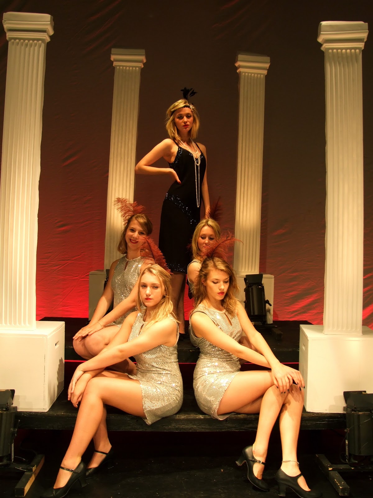
The picture to the left is to show our star Georgina sat on the steps. we had the pillars and black steps with a light under each pillar to create a more show business style.

The back drop is a sheep of white with a red light behind it. this was like a curtain. that we could pull back and fourth when we needed it and when we were using the green screen.
The set was used for the main beginning and we plan in post to keep coming back to the more narrative section of our video when the music becomes old fashioned again. The narrative would subtly reflect that she lives well off. She has dancers and pillars and a big red curtain. This shows that the song could have her coming off as spoiled or very demanding due to the words "get outa here and get me some money too" when she has lots already


To the left this picture is the set from a wide camera shot with our dancers this is with the house lights on. this is to simply show the characters in positions that myself and my group put them in as experimentation's for the album cover and poster as well as the shoot day diary shots to help show our set from a behind the camera point of view
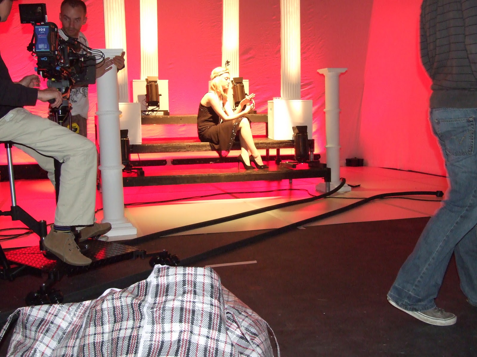
 This is the beginning shot of Georgina that we used for the poster. We edited it the colour and created a more sophisticated look with a dark grey background colour.

here she is wearing her full attire that she wore throughout the day which was wholly 1920's style. the dress, the pearls the feather and the eye make up and lipstick. we experimented this image into older looking effects and black and white which we used in the poster however this image is my personally favourite because of the coloring and contrasts.


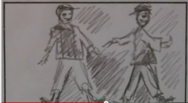
The day went through with a steady and on time pace and we had finished the dancing we decided to include our Zoetrobe shots now. This consisted of us coming up with a repetitive action for our cast to do. This was already pre-determined these moves, we decided to do a passing of the hat and a cane etc. This was a nice experiment for our group and it made me even more exited about the editing phase of our production task.

The second half part of the day was when we built our second set. this was a big stair case and pillars for the beginning and end stage of the song this was a long process because we wanted to include lots of tracking shots, the beginning one when we track in when Georgina walks in and then the tracking shot following her as she walks in following the camera. This shot took a lot of takes simpley because the tracks were complex and required a huge amount of concentration and a number of times we had a small kink in the tracks.

All in all the day finished on schedule and it was very enjoyable and self full filling. we now need to look forward to the post production in the editing phase and after effects on the green screen shots.

Friday, 4 November 2011

This is the shots i took of the dancers in a pose that I decided to go into with some close ups of them to show the Mise en scene of our video, their  make up clothes and accessories.
This is also to show our Mise an scene to show her costume and make up in the setting of black and white which is what the majority of our video will be in.


LOOKING AT LABLES

I looked at this lables website 
SLAMJAMS
they have been going on since 1996 and its aim is to go against the major conglomerate companies
-They have info on all of the employees. They include their names their positions and an email address for each of them
- They include videos of all of their artists
- Gives the latest new articles on their artists
- You can download
-There also on My Spaces, Twitter and Face book
-They do tours
-They sell DVDs

Saturday, 15 October 2011

Feedback

There are some proficient posts here which illustrate the development of your concept and planning of production  This is insightful and creative, for example planing of the set design and reflection upon this.
You do need to develop the evaluation of the animatic and also consider the following points in relation to your posts:


First to begin using a wider range of blogging tools - there are lots of well presented images, but use of Flickr or powerpoint will increase the creativity that is shown on your blog.  Images on the posts are good, but could be better if you started to use presentational tools

Second the valid, detailed and reflective comments that you make need to be developed further with  key media concepts and theoretical ideas;  for example, link the planning to star image,  or how set design and lighting link to mise en scene and/ or what model's of lighting you are using in relation to your set - key, fill, directional, discuss the untensity and colour and what you are trying to represent about your artist. This will help make a more thorough evaluation of your work.

Friday, 14 October 2011

Shooting list

08:30 AM: Gather cast and crew and talk through day
08:45 AM: Get into Costume/Makeup (Heather)
09:00 AM: Set up camera/tripod e.t.c 
09:15 AM: Start shooting close ups of Lead Singer
09:30 AM: Start shooting wide shots of Lead Singer
09:45 AM: Shoot the Zoetrobe (Close Ups/Mid Close Ups/Wide Shots)
11:00 AM: Wide Shots of Dancers on black rostra.
11:15 AM: Mid Shots of Dancers on black rostra.
11:30 AM: Dolly shots of Dancers on black rostra.
11:55 AM: Sillhouettes of Lead singer (poses against white backdrop)
12:15 AM: Breaking jewellary (Lead singer) to be reversed in post
12:30 AM: Coins falling to be reversed in post

12:45 AM: Lunch Break

01:20 PM: Finish Lunch and meet back in studio to get back into costume e.t.c

01:25 PM: Shoot Gramaphone with record on.
01:35 PM: Shoot DJ Decks and scratching.
01:50 PM: Shoot sillouettes (Mulitply slowly in post) against white.
02:15 PM: Ben & Tunde cleaning shoes (Close Up/Mide Shot)

02:30 PM: Roullette wheel spinning (be reversed in Post)
02:45 PM: Chair Crashing to the floor
02:55 PM: Shot of China Plates Falling and Smashing (Plates/mugs/glasses e.t.c)

Thursday, 13 October 2011

OUR SET SKETCHES

We thought that our ZOETROBE would look a little bit like this. we wanted to make it work with the old legends of music.

This is what our band will look like we are still unsure whether it will look good with her within the band scene. However we are going to put her there and then if it doesnt work or look correct on the day as we will be able to hgave an acurate shot.

This is our stage and idea with the sillhouetes.

We have used this drawing to help show that we want a spot light on our main girl.

This is our big main stage area where we want the main area to be used for the majority of the filming.