Friday, 10 February 2012

Feedback on Directors commentary

Excellent and considerate understanding of the technologies used in production of the video for example After effects and FCP..  There are evident links between creative decision making and use of technology on both productions of the video using professional digital cameras (e.g focus pulls) and in the post production editing process – in discussion of continuity.  This is sustained and thorough and accurate in discussion of the art deco themes of the MV.  The commentary shows a discrete awareness of the use of new media technology and uses discriminating examples really well in terms of graphic design and animation.  Excellent command of terminology and well presented.

Covers sound and technology. Exemplifies After Effects well and the use of chromokey as an effect.  Excellent commentary, well done.

Feedback on Director's Commentary

Evaluation Task 4


The first stage of the development in Photoshop was the coloring.
In this shot we colored in different ways to see what worked best. The faded blue shades, in mine and my group’s opinion worked well with the black and white however we ended up not using these images in the final digipak as it didn’t fit with the final design although it really helped me learn more basic skills on Photoshop to practice and use the trial and error technique till we felt as a team it looked right.


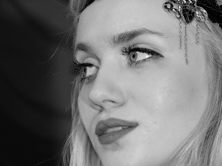
The main image on our digipak was the close up of our actress Georgina. We manipulated this image in many different ways until we found an image we liked to start with we put the image next to each other to see the comparisons and whether just the one image repeated made a good design putting all the necessary items on the digipak we decided it didn’t look close enough to our chosen design. We then went back and kept the one image we had worked on from the start because we wanted to keep the star image as the main aim of the image of the band.
We used art deco from Internet images and Internet colors I selected using print screen and the clone tool. Selecting images of my own from the dancers I filled in the figure and deleted the background to create a silhouette like our art deco in after effects in the music video.


I used the layering tool to layer the same image on top of each other and surface blurred on in the liquefy tool. Then I used the rubber to rub the few flaws to blur them our and create a fake perfect complexion. I then selected the burn tool and used it around the eyes and the pupil to create an idea of bigger thicker eyelashes. I then used the dodge tool to lighten up the whites in her eyes and then changed the tints through turning it black and white and experimenting with the contrasting levels
The poster consisted of many different ideas we started with the idea of having a blocked square look like this is here and we decided it was not good plan for the final poster idea so we started fresh with a now concept of building it around one of the squares on the digipak with the color theme and the silhouette. I did this on Photoshop by selecting the main theme using the magnetic tool and then filled it in with the block color, and experimenting with the layering texts that you can add onto a new layer in Photoshop.